What is 13Foresight?
Every quarter, the most sophisticated institutional investors in the world — hedge funds, pension funds, endowments, and asset managers controlling hundreds of billions of dollars — are legally required to disclose their equity portfolios to the SEC. This data is public. But in its raw form it’s thousands of XML files full of CUSIPs, share counts, and regulatory codes that are nearly impossible to interpret.
13Foresight exists to close that gap. We parse every 13F filing from every manager with $100M+ in U.S. equity exposure, normalize the data, map holdings to live tickers, calculate performance metrics, and build the analytical layer that transforms raw disclosure data into actionable intelligence.
The result: a retail investor with a 13Foresight account has access to the same portfolio transparency that was once available only to Bloomberg terminal subscribers, prime brokerage analysts, and institutional research desks.
The Core Value Proposition
You don’t need to beat the market on your own. You can study the people whose full-time job is beating the market — see exactly what they own, how long they’ve held it, whether their strategy has historically worked, and how crowded a given trade is. That’s the informational advantage 13Foresight provides.
Data Sources
SEC Form 13F — The Foundation
Form 13F is a mandatory quarterly disclosure for any institutional investment manager with $100 million or more in qualifying U.S. equity securities. Filed within 45 days of each quarter-end, it discloses the manager’s entire long equity portfolio — every stock, every ETF, every U.S.-listed option — as of the last trading day of that quarter.
13Foresight ingests 13F filings directly from the SEC EDGAR system in real-time as managers submit them throughout the 45-day filing window. Each filing is parsed, CUSIP-to-ticker mapped via our securities reference database, validated for completeness, and loaded into our normalized data warehouse. The entire process — from SEC submission to visible holdings on the platform — typically takes under 5 minutes.
Market Price Data
To calculate performance, cost basis, and portfolio values, 13Foresight maintains a daily price history for every publicly-traded security. This price data is used to: calculate the appropriate reference price for each feature, simulate portfolio returns in the backtester on the filing date, compute estimated cost basis where only snapshot data exists, and derive all risk metrics (Sharpe, Beta, Volatility, etc.).
Risk-Free Rate
All risk-adjusted metrics (Sharpe Ratio, Alpha) use the 13-week U.S. Treasury Bill yield (^IRX) as the risk-free rate, updated monthly. This ensures that performance comparisons accurately reflect the prevailing "cost of doing nothing" at any given point in time — a critical distinction in high-rate environments where even sitting in cash carries a significant opportunity cost.
Metrics Explained
Price Held & Reference Pricing
When a 13F marks a position as "New", it means the manager first disclosed it in this quarter’s filing. But the actual purchase happened during that quarter — possibly 3 months earlier. Because 13F filings are snapshots rather than trade blotters, different product surfaces use different pricing bases for different jobs. Backtests and filing-sensitive signal metrics use the filing date (or the nearest prior trading day). Some legacy reference-price views may still use a reporting-period proxy when exact trade timing cannot be inferred from 13F data alone.
This distinction matters because a realistic copycat or backtest experience must start from the moment the position becomes public, not from a date before outside investors could have seen it. When a metric is only intended as an estimated reference price rather than a tradeable backtest input, we label and describe it accordingly.
Why Does a Historical Price Look "Wrong"?
All prices on 13Foresight are split- and dividend-adjusted. This means a stock that traded at $500 in 2020 and then did a 10-for-1 split will show a historical price of $50 for that period — not $500. This is the industry standard for calculating accurate returns: comparing pre- and post-split prices on the same scale.
A side effect: historical prices change retroactively whenever a stock splits or pays a large dividend. If you remember a stock "being at $200" in 2019 but we show $100, a 2-for-1 split happened after that date and every historical price was halved to reflect it. The return over any period remains mathematically correct — only the dollar figure looks different from what you'd find in a newspaper archive.
Signal Freshness
Every 13F filing is a lagged snapshot: the holdings it discloses reflect positions as of the quarter's last day, but the filing itself appears up to 45 days later. By the time you read it, the trade may already be weeks or months old.
Signal Freshness answers one question: "Am I too late to act on this position?" It shows how much the stock has moved relative to its SPDR sector ETF benchmark since two reference dates:
- Q-end — since the last day of the reported quarter (when the fund actually held this position).
- Filed — since the 13F filing date (when you could first act on this signal).
The gray bar in each row is the sector ETF (e.g. XLK for Technology). The colored bar is the stock. When the stock bar is close to the sector bar, the position has moved roughly in line with its sector — the company-specific part of the thesis has not yet played out, and the entry point is still relatively close to where the fund got in.
Color guide:
- Green (≤10% outperformance, including negative) — stock is tracking or lagging its sector. Signal is fresh; the entry point is still close to — or better than — where the fund got in relative to the market.
- Orange (10–25%) — the stock has meaningfully outrun its sector. The trade has partially played out; you are entering at a higher price than the fund's implied reference.
- Red (>25%) — the stock has significantly outperformed its sector benchmark since the filing. The original opportunity has largely been captured by earlier investors.
Important: strong outperformance is not always a reason to avoid the trade. It can mean the fund's thesis is correct and the stock's fundamentals are improving. Freshness tells you about entry timing and relative price, not about whether the long-term thesis is still valid.
Average Buy Price & Price History
For positions held across multiple quarters, 13Foresight reconstructs the manager’s full purchase history and calculates a weighted average cost basis. Every time a fund increases its share count quarter-over-quarter, we estimate the entry price for those newly disclosed shares using the best pricing basis available for that feature. For filing-aware analytics, that means the filing date or nearest prior trading day. For legacy estimation views that only reconstruct from quarterly snapshots, a reporting-period proxy may still be used. The result is a share-weighted average designed to approximate cost basis from public 13F evidence rather than private execution data.
The green or red percentage next to the average price shows the unrealized gain or loss relative to the current market price. A fund showing $25.40 (+67%) has more than doubled its money on paper from that average entry point — a strong signal that the position is deeply profitable and unlikely to be closed for tax-loss reasons.
Price History Sparkline
Each row displays a 13-month mini price chart for the stock, with two reference markers:
- Dashed gray line — the fund’s estimated average buy price. Positions where the stock has risen well above this line represent mature, profitable holdings.
- Red dot — today’s price. The closer the dot is to the top of the chart, the stronger the recent momentum.
- Green shading above the avg-buy line (or red shading below it) makes the profit/loss zone instantly visible at a glance.
Because the sparkline is identical across all funds on the same stock page, it provides quick visual context: funds whose dashed line is low on the chart have a much more comfortable cushion than funds that bought in near the recent highs.
Last Quarter Price
Below the average buy price, 13Foresight shows the closing price on the last day of the most recently filed quarter (e.g., $28.50 · Q3 ‘24). This is the price at which the fund’s position was valued when they submitted their 13F. It differs from the average buy price (which spans all quarters of accumulation) and from today’s price. Think of it as a checkpoint: where did this fund stand at the moment they last had to disclose?
Important caveat on accuracy:
13F filings report end-of-quarter snapshots — not intra-quarter trades. A fund can buy and sell the same stock multiple times within a quarter and only the net position appears in the filing. The average buy price shown is therefore an estimate based on observable entry points (quarters where shares increased), not a direct disclosure from the fund. All prices are split- and dividend-adjusted, which means a stock that split after the fund’s entry will show a lower historical price than what the fund actually paid in nominal terms.
Portfolio Concentration
Concentration measures the weight of a position in a manager’s total disclosed portfolio. A 25% concentration in a single stock is a very different signal than a 0.5% position — the former represents genuine high-conviction belief, the latter may be a small speculative bet or a legacy holding. 13Foresight surfaces concentration prominently because where a manager bets big is where you should pay the most attention.
Performance Metrics — Common Misconceptions
Why can Alpha be positive when a fund underperforms the S&P 500?
This is one of the most misunderstood concepts in investing. Consider a fund with a Beta of 0.25 that returns 11% in a year where SPY returns 22%.
CAPM says: Expected Return = Risk-Free Rate + Beta × (Market Return − Risk-Free Rate). With a 5% risk-free rate: Expected = 5% + 0.25 × (22% − 5%) = 9.25%. The fund returned 11%, which is 1.75% above its risk-adjusted expectation — that’s positive Alpha.
This fund took one-quarter of the market’s risk and still beat expectations. It didn’t beat the raw index — but a rational investor comparing risk-adjusted performance should prefer this fund over a higher-beta fund with a slightly better raw return.
Why does SPY sometimes show a negative Sharpe Ratio?
Sharpe Ratio = (Average Return − Risk-Free Rate) ÷ Volatility. When the risk-free rate (Treasury yields) is higher than market returns over the selected period — as happened during 2022 when SPY fell ~18% while T-bills yielded 4%+ — Sharpe turns negative. This is not an error. It accurately communicates that over that specific window, holding cash was objectively superior to holding the index on a risk-adjusted basis.
How to read the Calmar Ratio
Calmar = Annualized Return ÷ |Max Drawdown|. A Calmar of 1.5 means the strategy earned 1.5% annually for every 1% of maximum peak-to-trough decline. It answers the question every serious investor must ask: "Is the return I’m getting worth the pain I have to survive to get it?" Two funds with 15% annual returns but Calmars of 0.5 vs. 2.0 are fundamentally different risk propositions.
Risk Metrics Block
This module answers one hard question before you copy any manager: "What pain do I need to survive to earn this return?" Most investors focus on upside and only discover their true risk tolerance inside a drawdown. Risk Metrics exists to move that realization forward, before capital is at risk.
Why this matters in practice: a strategy can look strong in trailing return, yet still be dangerous for your personal time horizon if its drawdowns are too deep or too long.
If you skip risk diagnostics, the most common outcome is not "slightly lower return". It is abandoning a strategy at the worst possible time because the volatility profile was never understood up front.
How To Read This Block
Read it like a retail investor, not a quant
You do not need to decode every metric. You only need to answer four practical questions before trusting a manager with your attention or your capital.
1. Can this strategy punch harder than I can tolerate?
The top row is your fast filter. Ignore the math names for a second and look at the picture they create together: if volatility, VaR, drawdown, and tracking error all look elevated, this is not a calm strategy even if recent returns look attractive.
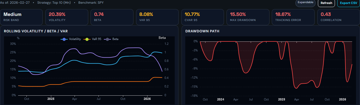
Labels in plain English
- Risk Band: a simple heat label. "Medium" means this is not ultra-safe, but also not the wildest profile on the platform.
- VaR 95: a rough answer to "how bad can a bad period get?" If it shows 14.76%, read it as: in roughly 1 out of 20 comparable periods, losses may be worse than that.
- Tracking Error: how far this strategy tends to wander away from the benchmark. Higher means a bumpier ride relative to the index.
- Correlation: how similarly it moves versus the benchmark. Closer to 1 means it usually moves with the market, closer to 0 means it behaves more independently.
2. Is risk getting worse now, or did it only look bad once?
The history charts help you separate a one-off scar from a repeating problem. Rising risk with weakening behavior is usually a warning. A deep drawdown that took forever to recover is also a warning, because many investors quit long before recovery actually arrives.
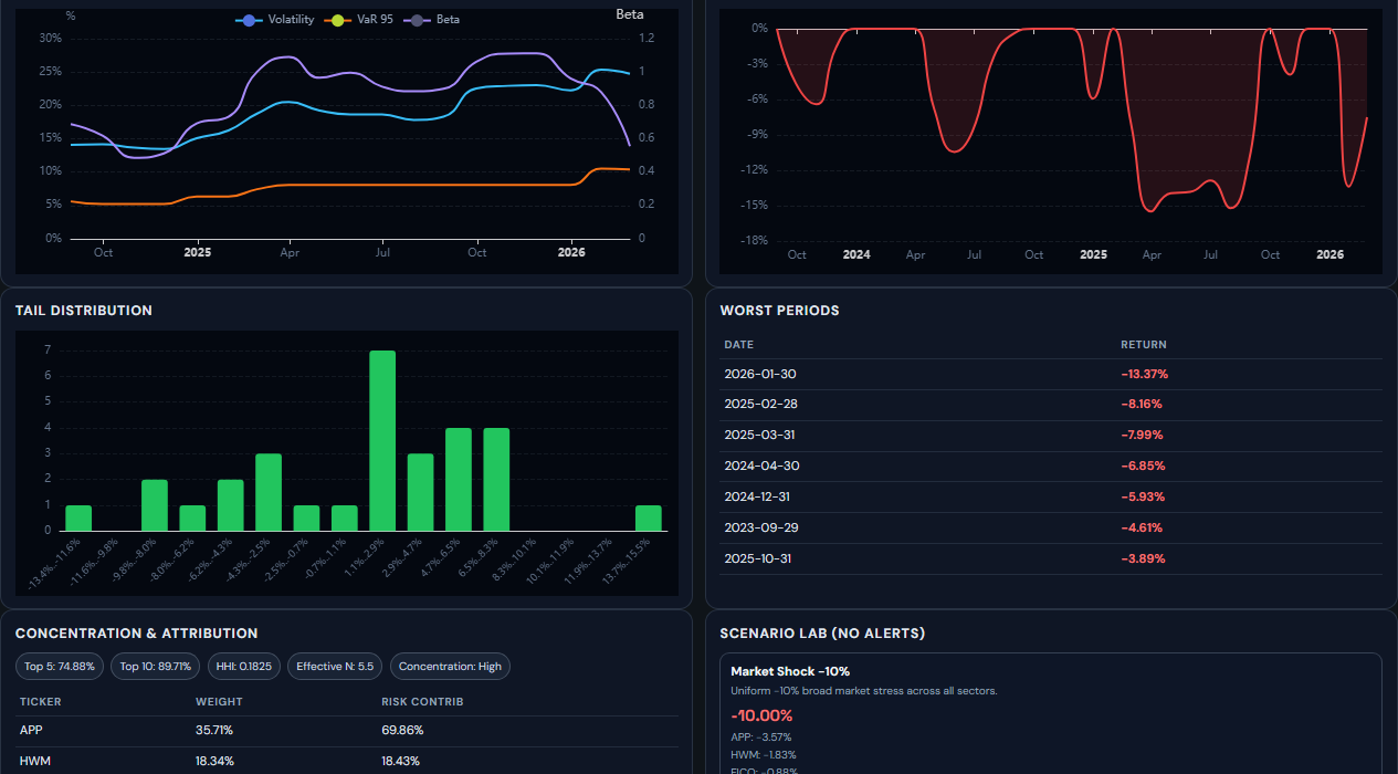
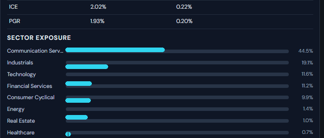
3. Is this secretly one big bet wearing many ticker symbols?
This is where the block becomes very useful for retail users. A portfolio can hold many names and still be dangerously concentrated. Sector Exposure and Concentration tell you whether one theme, one sector, or one cluster of names is doing most of the damage if things go wrong.
Concentration labels
- HHI: a concentration score. Higher means fewer holdings are carrying more of the portfolio.
- Effective N: the rough number of truly meaningful bets. If this number is low, the portfolio is less diversified than it first appears.
4. What happens if tomorrow is simply bad?
Scenario Lab is not there to predict the future. It is there to remove fantasy from your planning. It gives you a rough stress view so you can ask the only question that matters in advance: if this gets hit, will I still be comfortable holding it?
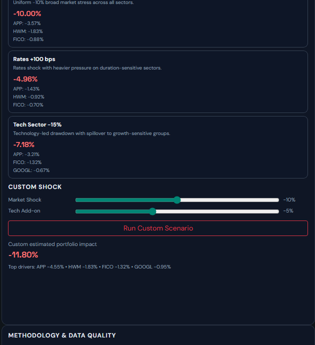
What Custom Shock means
Custom Shock lets you build your own ugly day. It is not a prediction engine. It is a planning tool: "If the market drops and tech gets hit harder, what happens to this portfolio?" Use it before sizing up, not after a drawdown starts.
Free vs paid access
Free users can still use the full module. The main limitation is history depth. Paid users get the full archive. This page is database-backed, so it does not need heavy live Yahoo Finance parsing just to open.
Fund Backtester
The Backtester is 13Foresight’s flagship feature. It answers the most important question you can ask about any institutional manager: "If I had mirrored this fund’s disclosed portfolio at every quarterly filing date, what would my actual returns have been?"
Most fund performance databases show you a fund’s actual P&L — which includes short positions, leverage, intra-quarter trading, and derivatives that you as a copycat investor can never replicate. The 13Foresight Backtester shows you something more honest: the achievable performance of following only the publicly disclosed long book, using realistic entry timing.
How the Simulation Works
At each quarter-end, the backtester identifies the manager’s disclosed holdings and rebalances the simulated portfolio on the filing date (not the quarter-end date). This is critical — it respects the 45-day lag. If a Q4 2023 filing was published on February 9, 2024, the simulation enters those positions on February 9, not December 31. This is what a real copycat investor could actually do.
Returns are calculated using daily closing prices from entry to the next rebalance date, capturing dividends and corporate actions. The result is a month-by-month equity curve you can directly compare against SPY, QQQ, IWM, and DIA.
Equal Weight vs. Manager Weight
Equal Weight
Every holding gets the same allocation regardless of the manager’s actual position sizes. This removes concentration risk and produces a more diversified simulation — useful for evaluating a manager’s stock-picking ability independent of their sizing discipline.
Manager Weight
Allocations mirror the manager’s actual reported position sizes, proportionally. If a fund had 40% in NVDA, your simulated portfolio does too. This is the closest replication of the manager’s actual strategy — but also means concentration risk is fully inherited.
Top-N Filtering
Rather than mirroring all 80+ holdings of a diversified fund, you can limit the simulation to the manager’s top N positions by portfolio weight. This tests the hypothesis that a manager’s highest-conviction bets (their top 10 or top 20) outperform their full portfolio — a thesis supported by significant academic research on active management skill concentration.
Market Heatmap
The Market Heatmap answers one of the most valuable macro questions in investing: "Where is institutional capital actually flowing right now?" Not where pundits say it’s flowing — where it’s actually going, according to the disclosed positions of thousands of institutional managers.
The heatmap aggregates 13F filings from the Top 200 institutional managers (by AUM) for the latest quarter and visualizes the total institutional capital deployed in each sector and industry. The size of each tile represents total institutional AUM in that sector. The color represents the quarter-over-quarter change — green sectors are seeing net inflows (managers collectively adding), red sectors are seeing net outflows (managers collectively reducing or exiting). The Top 200 cut keeps the signal dominated by the managers whose flows actually move markets, rather than diluted by thousands of small filers.
Why This Matters for Your Portfolio
Smart money flows often lead price. When institutions collectively rotate out of a sector — even before it shows up in price — it’s a meaningful signal that large allocators have updated their thesis. Conversely, sectors seeing accelerating institutional inflows despite flat prices can represent early-stage opportunities that haven’t yet been priced in by the broader market.
Use the Heatmap as a macro filter: before doing deep stock research in a sector, check whether institutions are adding or reducing exposure. Investing alongside smart money is not a guarantee — but investing against a coordinated institutional exit is a risk you should at minimum be aware of.
Portfolio Builder
What happens when you combine the holdings of multiple institutional managers into a single portfolio? The Portfolio Builder lets you construct a custom multi-manager composite portfolio and backtest it — answering questions like: "Would a portfolio that blends Berkshire Hathaway’s top 10 with Tiger Global’s top 10 have outperformed either alone?" or "Does diversifying across three managers reduce drawdowns without sacrificing returns?"
How to Use It
Select up to 10 managers (Premium: unlimited), choose how many top holdings to take from each, set a weighting mode, and run. The builder deduplicates overlapping tickers across managers — if three funds all hold Microsoft, it won’t triple-weight it unless you explicitly choose to include duplicates. The result is a clean composite portfolio with a full backtest equity curve, risk metrics, and attribution breakdown.
Correlation Matrix & Diversification Analysis
Adding multiple funds doesn’t automatically improve diversification — if two "different" managers both have heavy Magnificent 7 exposure, combining them barely reduces correlation. The Portfolio Builder includes a Pearson correlation matrix showing how returns from each component fund’s top holdings co-move with each other, plus an ENB (Effective Number of Bets) score that measures true portfolio diversification. A portfolio of 50 stocks with ENB = 3 is actually a concentrated bet on 3 themes — the matrix makes this visible.
Why Retail Investors Need This
Institutional multi-manager portfolios are constructed by teams of quantitative analysts with access to sophisticated risk systems. The Portfolio Builder puts a simplified version of that infrastructure in your hands: you can test portfolio construction hypotheses, stress-test diversification assumptions, and build a watchlist of institutional positions that collectively satisfy your risk preferences — all without a single line of code or a Bloomberg terminal.
Manager Rankings
There are over 5,000 institutional managers filing 13Fs. Most of them are mediocre. A small minority consistently generate risk-adjusted outperformance over multiple market cycles. Manager Rankings exist to find that minority.
The Rankings leaderboard is not sorted by raw returns — any levered fund in a bull market looks good on raw returns. It’s sorted by a composite score that simultaneously evaluates five dimensions of manager quality:
3-Year Annualized Return
Raw compounded return of the disclosed long portfolio over the trailing 3 years, net of the 45-day filing lag. Measures absolute performance.
Sharpe Ratio
Return per unit of volatility, adjusted for the risk-free rate. Rewards managers who deliver consistent, low-noise performance over those who simply rode market beta.
Alpha vs. SPY
CAPM-derived excess return above what the manager’s beta exposure would predict. The purest measure of skill — separating market tailwind from genuine stock selection.
Max Drawdown
The deepest peak-to-trough decline over the period. Managers who protect capital during downturns score better — because avoiding large losses is mathematically more powerful than chasing large gains.
Calmar Ratio
Return per unit of maximum drawdown. The composite risk-reward metric that rewards the most efficient generators of return relative to the worst-case loss investors had to endure.
Each metric is percentile-ranked across all funds in the database, then combined into a single 0–100 composite score. This peer-relative approach ensures the Rankings are meaningful regardless of market conditions — the #1 fund excels relative to all peers, not just relative to an absolute threshold that becomes meaningless in different market regimes.
Use Rankings as a discovery and screening tool: find managers whose style, AUM bracket, and concentration level match your investment thesis, then examine their fund page to understand why they rank well — is it concentrated bets in a hot sector, or genuine multi-cycle consistency?
13F Score™ Methodology
The 13Foresight Score (13F Score™) is a per-fund quality rating displayed prominently on every fund profile. It condenses a manager’s full multi-dimensional performance record into a single 0–100 number, making it easy to compare managers at a glance without needing to manually interpret five separate metrics.
It is calculated as a weighted composite of the same pillars used in Rankings, but normalized to the fund’s own history rather than purely peer-relative. This means a fund’s 13F Score reflects both its absolute quality and its performance consistency over time. A fund with a 13F Score of 85 is genuinely high-quality by any reasonable standard — not just high-quality relative to a poor peer group.
Efficiency Analysis
How much return does the manager generate per unit of volatility and drawdown? This pillar rewards capital efficiency — extracting maximum performance while consuming minimum risk budget.
Pure Alpha Isolation
The fraction of returns that cannot be explained by market Beta exposure. High Alpha isolation means the manager is genuinely making superior stock-selection decisions — not just riding the S&P 500 with leverage.
Resilience Scoring
Performance during identified market stress periods (2020 COVID crash, 2022 rate shock, etc.) and the speed and completeness of subsequent recovery. Managers who hold up during downturns and recover quickly earn top scores here.
Consistency Metrics
How frequently does the manager outperform SPY in any given quarter? What percentage of rolling 12-month windows show positive Alpha? Consistency separates structural skill from lucky streaks.
Multi-Horizon Scoring
13F Scores are calculated across 3-year and 7-year horizons independently. A manager can score high on 3Y (recent tactical performance) but lower on 7Y (hasn’t proven consistency across a full market cycle). The gap between the two scores is itself informative — a large 3Y–7Y spread suggests recency bias risk, while convergence signals durable, structural skill.
Crowding & Smart Money Signals
When every major hedge fund simultaneously holds the same stock, an invisible risk accumulates that standard portfolio analysis doesn’t capture. Crowding risk — the danger that a heavily institutionally-owned stock will experience a violent, self-reinforcing selloff when one large holder decides to exit — is one of the most underappreciated sources of tail risk in modern markets.
Crowding Score
Every stock tracked by 13Foresight receives a Crowding Score (0–100) calculated from two dimensions:
- Breadth: How many institutional managers (out of all filers) hold this stock? A stock held by 2,000 of 5,000 managers is more crowded than one held by 50.
- Concentration: What percentage of total disclosed institutional AUM is in this stock? A stock that represents 8% of all 13F capital is dangerously concentrated at the aggregate level.
High-crowding stocks often outperform when sentiment is positive — everyone buying the same thing drives the price up. But they carry asymmetric downside: when sentiment turns, there are too many sellers and not enough buyers. The 2022 Nasdaq selloff and the August 2024 yen carry unwind are textbook examples of crowding risk materializing across popular institutional positions simultaneously.
Smart Money Pulse
The Smart Money Pulse aggregates the net conviction changes across all institutional managers for any given stock: how many are adding, how many are reducing, and what is the net change in total institutional shares held quarter-over-quarter. A stock seeing consistent, broad-based institutional accumulation — not just one large buyer — is a qualitatively stronger setup than one where a single manager explains all the inflow.
Conviction Dynamics
Tracking what institutions hold is only half the picture. The other half is tracking how their conviction is changing over time. Conviction Dynamics surfaces the behavioral signals hidden inside quarter-over-quarter position changes.
Position Change Signals
At each fund profile, 13Foresight classifies holdings into six behavioral categories based on how the position changed from the prior quarter:
First time disclosed
Added shares
Same share count
Sold some shares
Exited entirely
Bought back after exit
Managers rarely explain their trades publicly. These behavioral signals are the closest proxy to understanding conviction in real time. A fund that consistently increases a position over 4 consecutive quarters while the stock drops is displaying maximum conviction — they believe their thesis and are dollar-cost averaging against the market. That’s a very different signal than a one-quarter addition followed by immediate reduction.
Historical Weight Trajectory
For each holding on a fund profile, 13Foresight displays the full weight history — how large this position has been as a percentage of the fund’s total portfolio in every quarter it was held. A position that grew from 2% to 18% over two years tells a story of building conviction. One that has shrunk from 15% to 3% over the same period signals an exit in progress, even if the fund hasn’t fully sold out yet.
Sell Timing Quality
Visible on every stock page, the Sell Timing Quality column scores how well each institutional holder has historically timed their exits from that specific stock. It is loaded on demand — click the ▶ button in the column header to fetch it.
How It Is Calculated
For every quarter where a fund reduced its position by at least 5% of shares held, we measure whether the stock's price was lower or higher 90 days later:
- Good trim — price fell after the sale (the fund avoided the drawdown).
- Poor trim — price rose after the sale (the fund left gains on the table).
Each event is weighted by the size of the reduction so that trimming 40% of a position counts more than shaving 5%. The volume-weighted average across all qualifying events produces the fund's timing score for that stock.
Consistently sold before declines
Mixed or break-even timing
Trimmed before further gains
Why "Poor" Is Not Always a Red Flag
This is the most important nuance of the metric. Consider a fund holding 30% of its portfolio in a compounding compounder — say, a semiconductor leader that has risen 10× over a decade. Every quarter the fund trims a few percent to keep the position from overwhelming the portfolio. The stock keeps climbing, so every trim looks "poorly timed" in hindsight.
In reality that fund is doing exactly the right thing: disciplined rebalancing of a concentrated winner. A "Poor" Sell Timing score in this context reflects the stock's relentless uptrend, not a flaw in the manager's decision-making.
The signal is most meaningful when you read it alongside the stock's price history:
- Strong uptrending stock + Poor timing — expected and benign. The fund is trimming a winner for risk management, not because they're bearish.
- Flat or declining stock + Poor timing — more telling. The fund is reducing before further rallies that didn't materialise, or is slow to exit a deteriorating position.
- Any stock + Good timing — the fund has a demonstrated ability to reduce exposure ahead of meaningful drawdowns in this name.
A minimum of one qualifying trim event (≥5% position reduction with price data available) is required for a rating to appear. Funds with no qualifying events show "—".
Anchor Holdings
An Anchor Holding is a stock a fund has carried as a significant, long-term position — not a trade, not a satellite bet, but a core conviction that the manager has maintained quarter after quarter regardless of market noise. A small icon appears next to the ticker in the holdings table when a position qualifies.
The Three Tiers
What Is "Median Weight" and Why Use It?
Each quarter a fund holds a stock, we record what percentage of the total portfolio that stock represents. Over time this produces a list of weights — one number per quarter.
The median is simply the middle value when you sort that list. Imagine a fund held Apple for 12 quarters with these weights:
Why not use the average? Because a single outlier quarter — say the fund briefly doubled down to 12% during a dip — would skew the average upward and inflate the tier. The median ignores outliers and reflects the fund's typical commitment level.
A position that was significant once but then trimmed to near-zero will have a low median and won't qualify — which is intentional. The badge should only appear on stocks the manager has consistently treated as a core holding.
What It Is Not
- It is not a prediction — a Gold Anchor stock is not guaranteed to keep rising.
- It is not a buy signal — the manager may be wrong.
- It is not based on rank within the portfolio, which can be misleading when portfolio size changes.
The badge is a structural label: it tells you which stocks this manager has treated as foundational, long-duration positions versus shorter-term tactical trades.
Live Demo — Try Before You Sign Up
Not sure if 13Foresight is right for you? The Live Demo gives you full, unrestricted access to our backtester and analytics on three real funds — no account, no credit card, no time limit. It’s not a mock interface or a stripped-down preview. Every premium feature is fully functional.
What the Demo Includes
- Full backtester — complete historical depth from fund inception, not truncated
- All weighting modes — Equal Weight and Manager Weight
- Benchmark overlays — compare against SPY, QQQ, IWM, and DIA simultaneously
- Full risk metrics — Sharpe Ratio, Max Drawdown, Annualized Volatility, Alpha, Beta, Calmar Ratio
- Underperformance highlighting — visualize quarters where the fund lagged benchmarks
- Top-N optimizer — find which subset of holdings maximized risk-adjusted return
- Sector allocation history — see how sector exposure shifted across all quarters
- 13F Score™ breakdown — full multi-pillar quality score with component explanation
Three Demo Funds Available
Weatherly Asset Management
A focused long-only manager — good example of concentrated conviction bets in large-cap equities.
Open Demo →Hawk Ridge Capital Management
A mid-size manager with a track record spanning multiple full market cycles, including both bull and bear periods.
Open Demo →Motley Fool Asset Management
A growth-oriented, broadly diversified portfolio — contrasts well with the more concentrated funds above.
Open Demo →The demo is read-only and limited to these three funds. To run backtests on any of the 5,000+ funds in our database, create a free account.
Account & Access
13Foresight uses Google OAuth for authentication — there are no passwords to create or remember. Click "Sign in with Google", authorize once, and you’re in. Your account is tied to your Google email, so it’s as secure as your Google account.
Free Account
A free account gives you immediate access to all 5,000+ fund profiles with 10 quarters (~2.5 years) of holdings history, the backtester with a matching ~2.5-year simulation window, the Portfolio Builder (up to 5 funds, equal weight only), and up to 10 saved favorites. No credit card required.
Premium Subscription
Premium removes all data depth limits, unlocks full Manager Rankings, the complete advanced analytics suite (Crowding, Conviction Dynamics, Scenario Lab, Correlation Matrix), unlimited Portfolio Builder, and CSV data export. It’s designed for serious investors who treat research as a professional activity, not a casual hobby.
Data Privacy
We store only your email address and session data. No financial information, no brokerage connections, no personal portfolio data. 13Foresight is a read-only research platform — we don’t touch your money.
Excel Audit Export PRO
Every fund page includes a downloadable Excel workbook — a professional audit file that lets you independently verify every number on the platform and build your own analysis on top.
Portfolio balance growth, full-period risk/return metrics (Sharpe, Sortino, Calmar, Ulcer Index, Alpha, Beta, Up/Down Capture) — computed for both the fund strategy and SPY over the same period for an apples-to-apples comparison.
On the Summary sheet, change the yellow cell (your investment amount) and Excel instantly recalculates Fund vs S&P results for your number. "$10,000 → $422,318 vs $72,330 in S&P" — with whatever amount you type.
Year × month grid — up to 27 years of monthly returns colour-coded from deep red to deep green, side-by-side with SPY. One glance shows every drawdown, every recovery, and every alpha streak.
Trailing 1Y / 3Y / 5Y / 10Y annualised returns for Fund vs SPY at every month — shows whether alpha is consistent or a lucky streak.
Every quarterly top-N position, re-weighted to sum to 100% for the selected strategy. Each row is colour-coded: green if the stock beat SPY that quarter, red if not.
Every formula explained in plain English — data sources, return calculation, benchmark definition, risk metric formulas, and disclaimers.
📍 Optimal Position Count — How It Works
The Holdings History sheet contains a feature unique to 13Foresight: for each quarter, the workbook automatically identifies the optimal number of positions — the point at which adding another stock starts reducing overall portfolio return rather than improving it.
The logic
For every quarter, we compute the compounded return of the strategy at each position count
from Top-1 through Top-50 using the pre-calculated monthly return columns in our database.
We then find the N where return(N) is maximised — that's the optimal cutoff.
An orange separator row marks this boundary in the Holdings sheet, showing the exact numbers: "Portfolio Top-8: +18.3% | Adding pos.9 → +17.1% (−1.2% change)"
Why a position can be "green" (beat SPY) but still hurt the portfolio
This is the most counterintuitive part — and the most valuable insight. Consider:
- The optimal Top-8 portfolio returned +18.3% this quarter.
- Position #9 (RGLD) returned +5.6% — well above SPY's +0.2%.
- So the row is green (beat SPY). But adding it dilutes the portfolio from +18.3% down to +17.1%.
This happens because portfolio return is a weighted average. When position #9 is added, all positions 1–8 give up a slice of their weight to accommodate it. Even though +5.6% beats the market, it's far below the +18.3% the concentrated portfolio was delivering — so adding it drags the average down.
Below the cutoff line, the colour in column G switches from "stock vs SPY" to "stock vs Portfolio" — so red below the line correctly means "this position earns less than your existing top-N portfolio", not just "it underperformed the index".
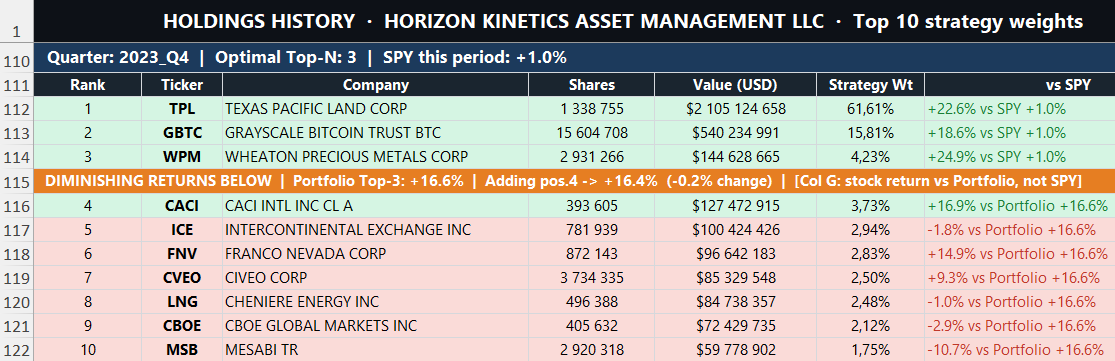
Holdings History sheet — orange banner marks the optimal cutoff (Top-3: +16.6%). Positions above are compared vs SPY; positions below show return vs the portfolio.
Smart Money Consensus & Elite Conviction
Every stock page on 13Foresight displays two proprietary signals derived from the SEC 13F filings of thousands of institutional managers: Consensus Score and Elite Conviction Score. Together they answer two different questions that raw holder counts cannot.
What "Smart Money" Means Here
Not every institutional holder carries the same signal value. A fund with a 10-year track record of beating the market through its top holdings tells you something very different from a fund that happened to buy an index ETF. Our signals are quality-weighted — each fund's contribution to the score is scaled by its independently computed 13F Score™, which reflects multi-year risk-adjusted outperformance relative to the S&P 500. A fund with a weak track record contributes very little even if it holds a large position.
Consensus Score (0–10)
Measures breadth: how many high-quality institutional managers have chosen to hold this stock. A high Consensus Score means the stock has cleared the bar for a large number of sophisticated, independently-managed portfolios — which is harder to achieve than it sounds, because most quality funds are highly concentrated and selective about what they own.
- 10/10 — Only the most widely-held names in the market reach this (think top-5 S&P 500 by market cap).
- 7–9 — Broadly held by quality managers. Strong institutional consensus.
- 4–6 — Growing interest from quality funds. Not yet a consensus name.
- 1–3 — Few quality funds hold this. Early-stage or overlooked.
Elite Conviction Score (0–10)
Measures depth: how meaningful the position is for the best managers who hold it. A high Elite Conviction Score means top-tier funds have made this a significant allocation — not just a token position. It is calculated from the top-3 holders by the product of their quality score and position size.
- 8–10 — Top funds have made this a major position. Rare and meaningful.
- 5–7 — Meaningful allocation from quality managers.
- 1–4 — Quality funds hold small or token positions.
How to Read the Combined Signal
| Label | What it means | What to look for |
|---|---|---|
| Strong Institutional Conviction | High breadth + high depth | Broad agreement among quality managers AND at least a few have made it a major position |
| Elite-Driven Opportunity | Low breadth + high depth | Only a few quality funds hold it, but those who do are highly committed — potential early signal |
| Broad Consensus, Selective Conviction | High breadth + moderate depth | Widely held but mostly as a small allocation — quality managers agree it belongs in a portfolio but aren't making big bets |
| Growing Institutional Interest | Moderate breadth + high depth | Several quality managers with meaningful positions — watch for Consensus rising over next quarters |
| Limited Smart Money Interest | Low breadth + low depth | Quality funds have little or no meaningful exposure |
Important Limitations
These scores are derived from 13F filings, which are quarterly snapshots filed up to 45 days after quarter-end. They do not reflect intra-quarter trading, short positions, or derivatives. A rising Consensus Score reflects what smart money held as of the last filing date — not what they hold today. Use these signals as one input among many, not as a standalone buy/sell indicator.
Disclaimer
Important — Please Read
13Foresight is an informational research platform, not a registered investment adviser, broker-dealer, or financial planning service. Nothing on this platform — including backtest results, rankings, crowding scores, cost basis estimates, conviction signals, 13F Scores, or any other data — constitutes investment advice or a recommendation to buy, sell, or hold any security.
Backtested performance is not actual performance. All backtest results are hypothetical simulations based on publicly disclosed holdings with a 45-day lag, equal or proportional weighting, and zero transaction costs beyond the commission setting. Real-world results would differ materially due to execution slippage, liquidity constraints, tax considerations, and the inability to perfectly replicate institutional position sizing.
13F filings represent only the long equity book of institutional managers. They do not capture short positions, leverage, derivatives strategies, private investments, or intra-quarter trading activity. The "performance" shown on 13Foresight reflects what a copycat long-only strategy would have achieved — not the fund’s actual P&L. Always conduct independent due diligence and consult a qualified financial professional before making investment decisions.